Tribeca Lawsuit Loans
Nationwide Legal Funding Company

About the Project
The redesigned website for Tribeca Lawsuit Loans, developed by our team, is a modern, high-performance platform that highlights the company’s trusted position in the legal funding industry. The design prioritizes conversion-focused architecture, ensuring users can easily learn about lawsuit funding options and apply for cash advances with minimal friction.
Built with SEO best practices, the website is structured to attract organic traffic from individuals searching for pre-settlement funding and related services. The site architecture emphasizes clarity, accessibility, and strong call-to-action elements, guiding visitors toward immediate engagement.
SEO-Friendly Legal Funding Website Design
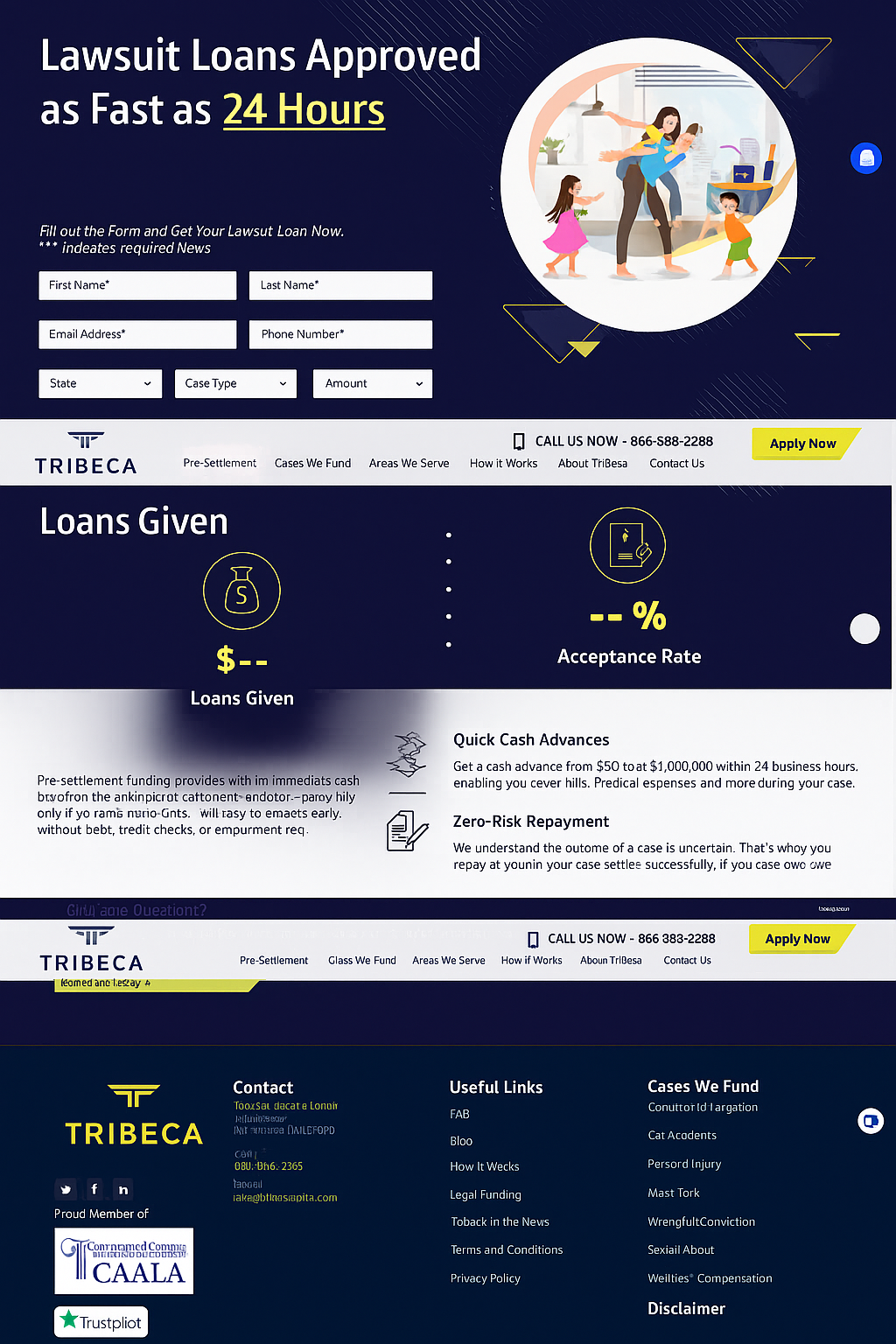
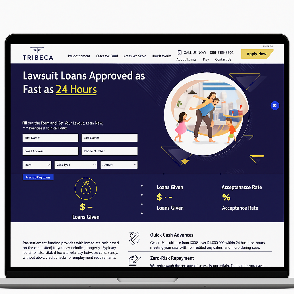
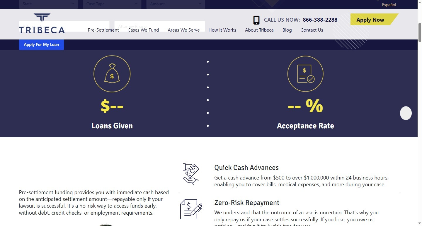
The homepage hero section immediately communicates Tribeca’s core promise — “Lawsuit Loans Approved as Fast as 24 Hours” — supported by an application form that invites action. Visual storytelling, reinforced by modern illustrations and strong color contrast, makes the message both approachable and trustworthy.
Navigation is simple and intuitive, allowing users to quickly access information on loan types, eligibility, and repayment policies. The design ensures that all key pages — from How It Works to Contact Us — remain easily accessible and consistent in tone.
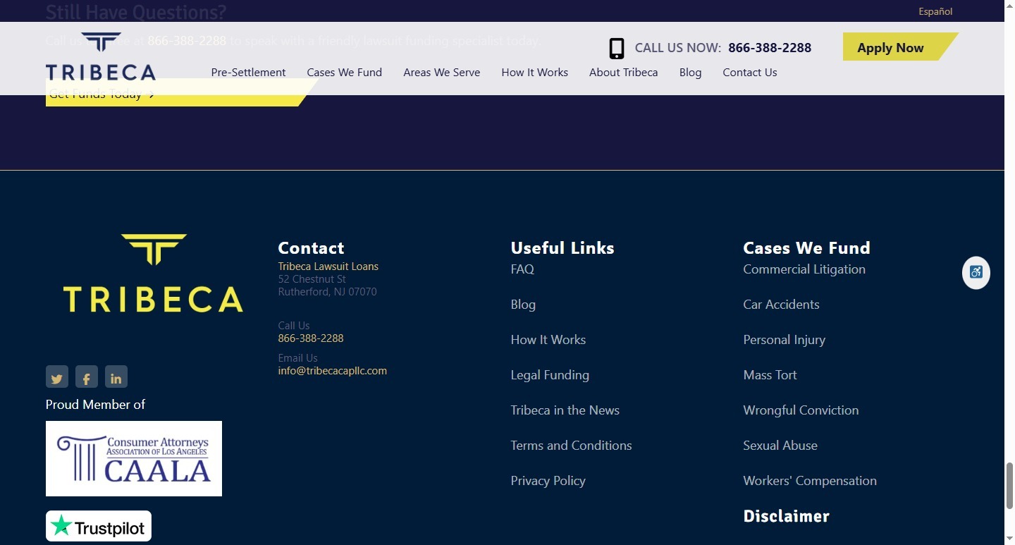
Testimonials, trust badges, and affiliations such as CAALA (Consumer Attorneys Association of Los Angeles) are strategically positioned to build credibility and foster confidence among potential clients.
Overall, the website delivers a seamless digital experience that reflects Tribeca’s reputation for reliability and speed in pre-settlement financing.
Typography & Color Scheme
The site employs modern sans-serif typography, ensuring excellent readability across all devices.
- Primary Color: Navy Blue (#1B2145) — conveys trust and professionalism.
- Accent Color: Bright Yellow (#F5C400) — emphasizes calls to action and draws attention to buttons.
- Neutral Base: White and Light Gray backgrounds — used to maintain visual balance and enhance contrast.
This color palette reinforces Tribeca’s identity as a dependable, client-focused funding partner, while the typography complements its clear and approachable messaging.
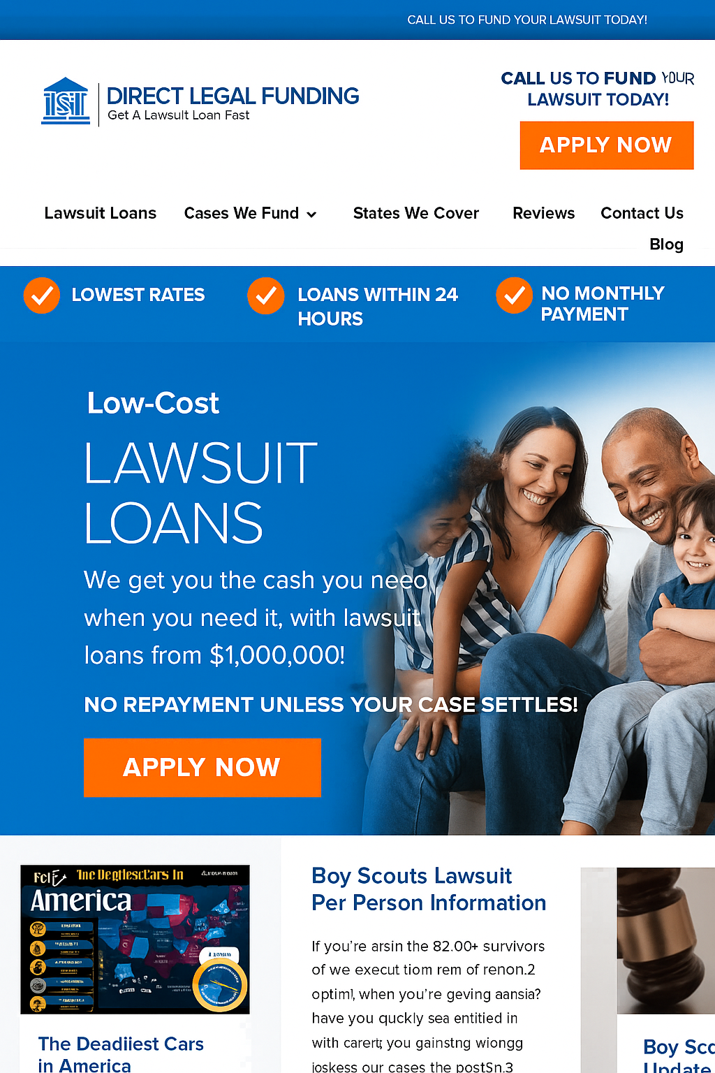
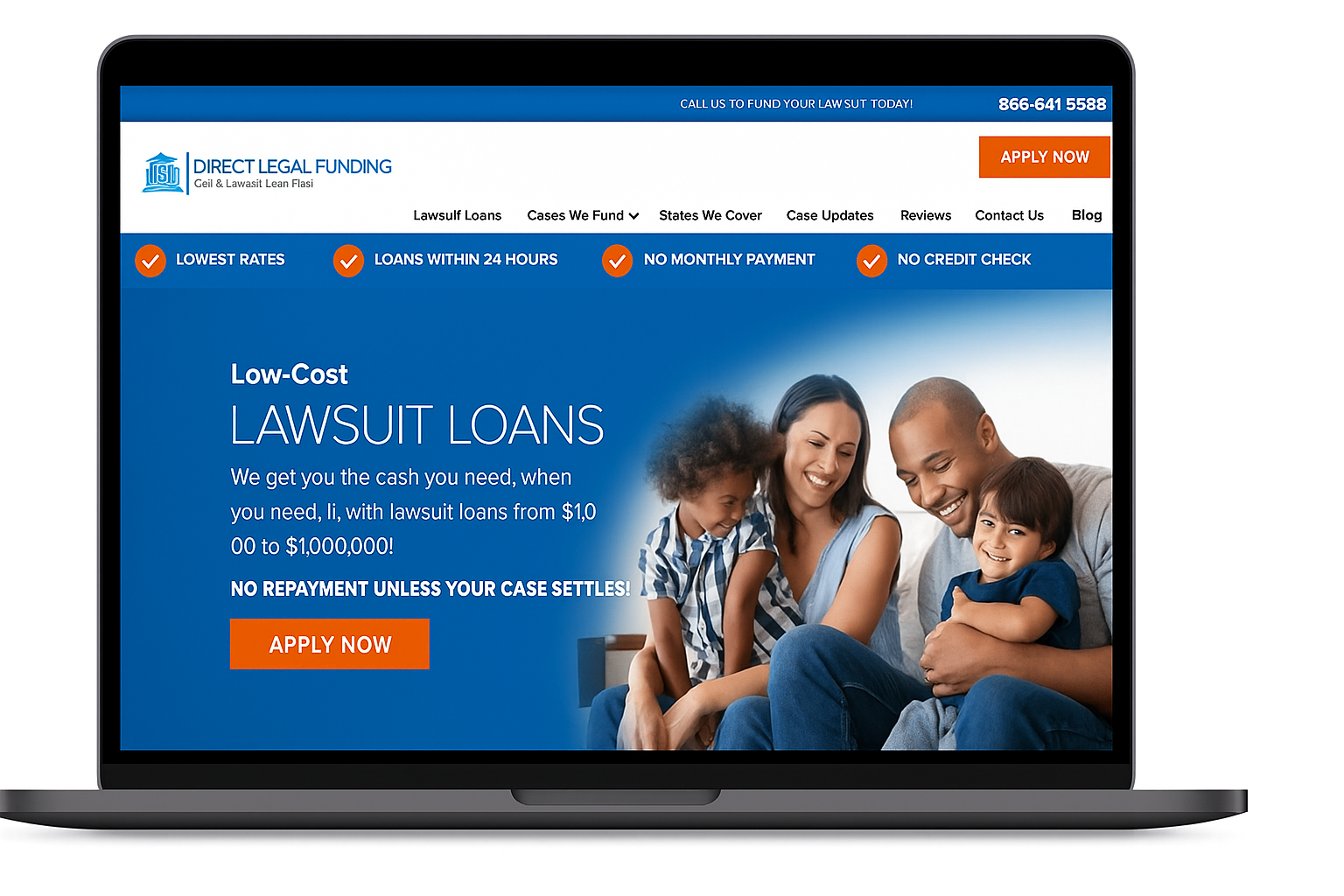
Direct Legal Funding
Nationwide Pre-Settlement Funding Provider
About the Project
The Direct Legal Funding website was designed to communicate trust, transparency, and accessibility in the highly competitive pre-settlement funding market. Our team created a clean, conversion-driven layout that quickly informs visitors about funding options while making the application process as seamless as possible. Every section of the website—from the bold hero banner to the testimonial-rich footer—is built to instill confidence and encourage engagement.
The site balances emotional appeal and functional clarity. The homepage instantly delivers the brand promise — “Low-Cost Lawsuit Loans” — paired with a strong call-to-action, “Apply Now.” This design approach reduces decision friction and leads users directly toward the next step, whether they’re learning about loan options, checking eligibility, or contacting the company.
SEO fundamentals were integrated from the start, ensuring high search visibility for key phrases such as lawsuit loans, pre-settlement funding, and legal cash advances. Structured navigation and optimized headings make it easy for search engines and users alike to find the information they need.
SEO-Friendly Financial Service Website Design
The user journey was streamlined for simplicity: a fixed top navigation with essential links, a visible phone number for instant contact, and consistent CTAs across the site. Client testimonials and Google ratings are prominently displayed to enhance trust and social proof — critical for financial service websites.
Informative blog posts and case updates provide valuable content that boosts authority while helping users stay informed about legal settlements and funding insights. The site’s responsive structure ensures a flawless experience on both desktop and mobile, maintaining strong performance across all devices.
Overall, the design reflects Direct Legal Funding’s commitment to speed, reliability, and client care, presenting them as a trusted partner for plaintiffs seeking pre-settlement cash advances.
Typography & Color Scheme
The site features clean sans-serif typography, likely Open Sans or a similar web-safe font, ensuring modern readability and professionalism.
- Primary Color: Deep Blue (#0062B8) — represents trust, security, and financial stability.
- Accent Color: Bright Orange (#F56A1B) — used for CTAs like “Apply Now,” symbolizing energy and urgency.
- Secondary Colors: White and Light Gray — maintain balance and enhance legibility throughout the layout.
This palette, paired with high-contrast type and approachable imagery, creates a design that feels both corporate and empathetic — exactly what users expect from a reputable funding company.
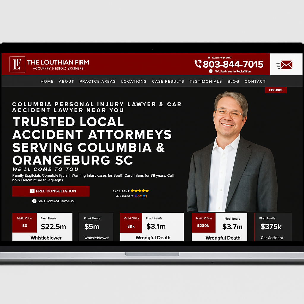
The Louthian Firm
Columbia, South Carolina Personal Injury & Accident Lawyers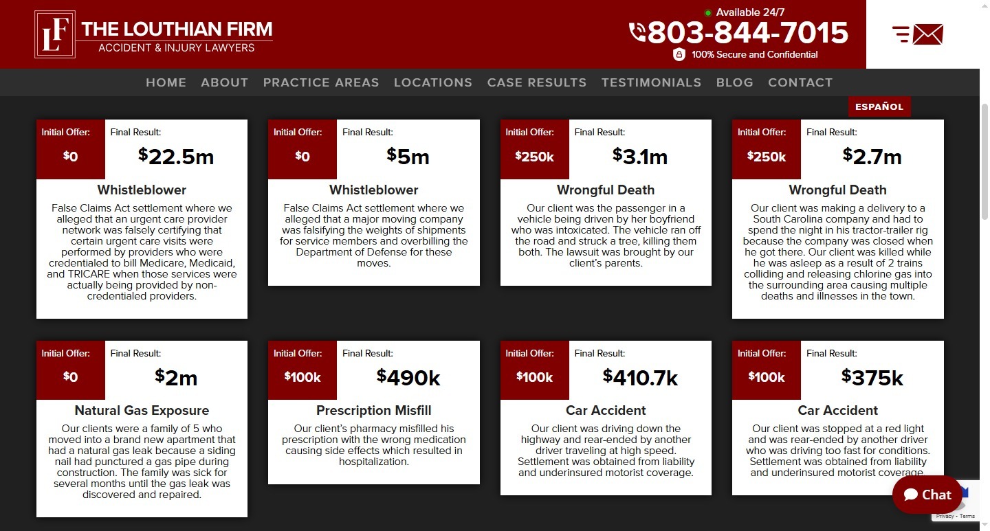
About the Project
The Louthian Law Firm website was designed to project authority, trust, and approachability—qualities essential for a personal injury practice with over 35 years of service. Our goal was to create a high-impact digital presence that instantly communicates the firm’s credibility while simplifying how potential clients connect with their attorneys.
The site’s structure emphasizes immediacy and reassurance. Clear typography, bold headlines, and a strong visual hierarchy guide users from discovery to consultation in seconds. A consistent “Free Consultation” call-to-action is visible across every page, reinforcing accessibility and inviting user interaction. Built on best practices for legal SEO, the site ranks effectively for local and practice-specific keywords, helping the firm stand out in a competitive South Carolina legal market.
SEO-Friendly Law Firm Website Design
The homepage introduces the firm’s trusted local presence with a dynamic hero banner that highlights its core message — “Trusted Local Accident Attorneys Serving Columbia & Orangeburg SC.” The professional portrait of the lead attorney adds a personal, human touch that builds rapport with visitors from the first impression.
Strong visual contrast—white text against deep black and red backgrounds—ensures maximum readability and engagement. Contact details, including a 24/7 phone number and chat support, are strategically positioned in the header for instant access. Throughout the site, testimonials and case results provide powerful social proof, showcasing multi-million dollar settlements that establish authority and inspire confidence.
The layout maintains clarity across all devices, with responsive optimization that ensures clients can easily reach the firm whether they’re on desktop, tablet, or mobile.
Typography & Color Scheme
The site’s typography combines bold, modern sans-serif fonts for headers with clean, readable body text, projecting confidence and professionalism.
- Primary Color: Deep Burgundy Red (#7A0C0C) — represents strength, passion, and legal authority.
- Secondary Color: Charcoal Black (#1A1A1A) — grounds the design and adds a premium, serious tone.
- Accent Color: White (#FFFFFF) — used for balance, clarity, and trust-building contrast.
This palette, paired with the professional imagery and confident copy, creates a digital experience that reflects the firm’s legacy of advocacy and client-first representation.
Trust Guss Injury Lawyers
Houston, Texas Personal Injury Law Firm
About the Project
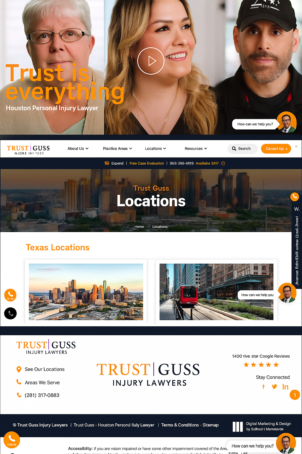
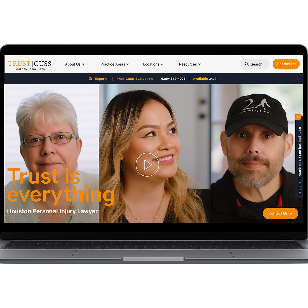
The Trust Guss Injury Lawyers website was designed to embody the firm’s most powerful brand promise — Trust is Everything. Every video, visual, and structural element reinforces that core message through a modern, transparent, and client-centered digital experience. The site establishes credibility and warmth through authentic imagery, confident typography, and user-friendly navigation that encourage visitors to seek help.
Our goal was to create a site that blends legal professionalism with emotional reassurance. The homepage hero immediately connects through real client portraits and a sincere tone, transforming a standard legal landing page into a story-driven experience of care and success. Built with SEO and accessibility best practices, the website supports multi-location visibility across Texas while maintaining fast load times and clean mobile responsiveness.
Typography & Color Scheme
The site’s color palette balances trust, energy, and professionalism.
- Primary Color – Warm Orange (#F7941E): Symbolizes optimism, trust, and action. Used for CTAs, accents, and headings to naturally draw the eye.
- Secondary Color – Navy Blue (#1A1D2A): Conveys stability and authority, grounding the layout and reinforcing credibility.
- Neutral Whites & Grays: Maintain clarity and space, ensuring legibility and modern elegance.
The typography features bold, sans-serif fonts that express confidence and clarity, complemented by clean spacing for readability across devices. Subtle visual hierarchy — such as highlighted phone numbers and persistent “Contact Us” buttons — ensures immediate conversion opportunities without disrupting flow.
User Experience & Features
The design places usability and accessibility at its core.
- Prominent 24/7 availability bar ensures quick access to phone or chat support.
- Integrated Spanish-language toggle (Español) supports bilingual engagement.
- Consistent sticky header improves navigation across practice areas, locations, and resources.
- Accessibility tools and mobile responsiveness ensure compliance and ease of use for all visitors.
The Locations page integrates rich visuals of Texas cities, building trust through familiarity and community connection, while client video testimonials deliver authenticity and proof of service impact.
Outcome
The result is a visually clean, conversion-optimized website that communicates reliability and compassion — the heart of the Trust Guss brand. Through cohesive colors, modern interface design, and human-centered storytelling, the website transforms digital trust into real client relationships.
Dolman Law Group
Florida Personal Injury & Mass Tort Lawyers
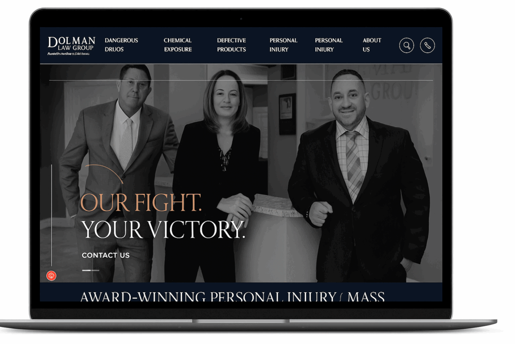
About the Project
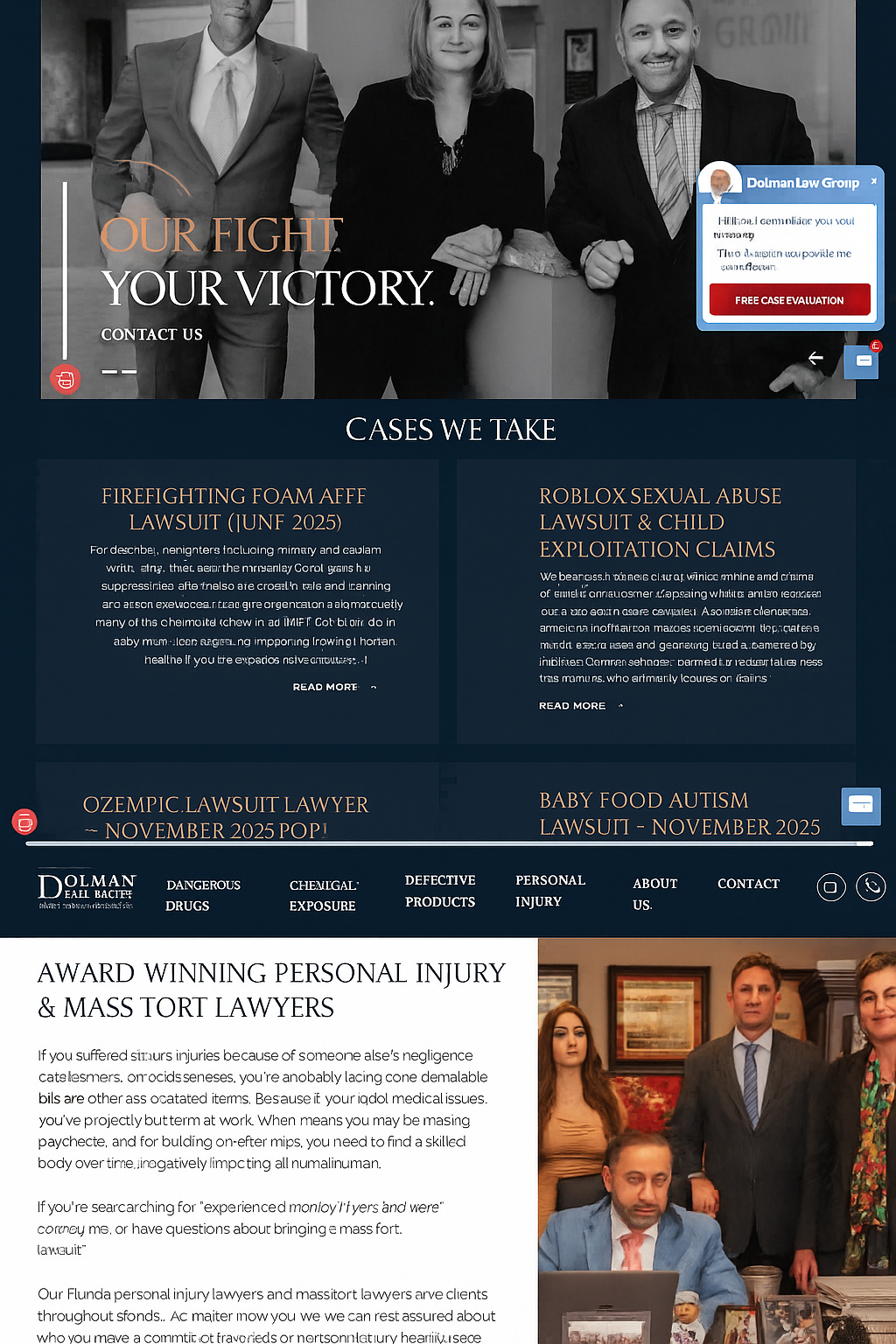
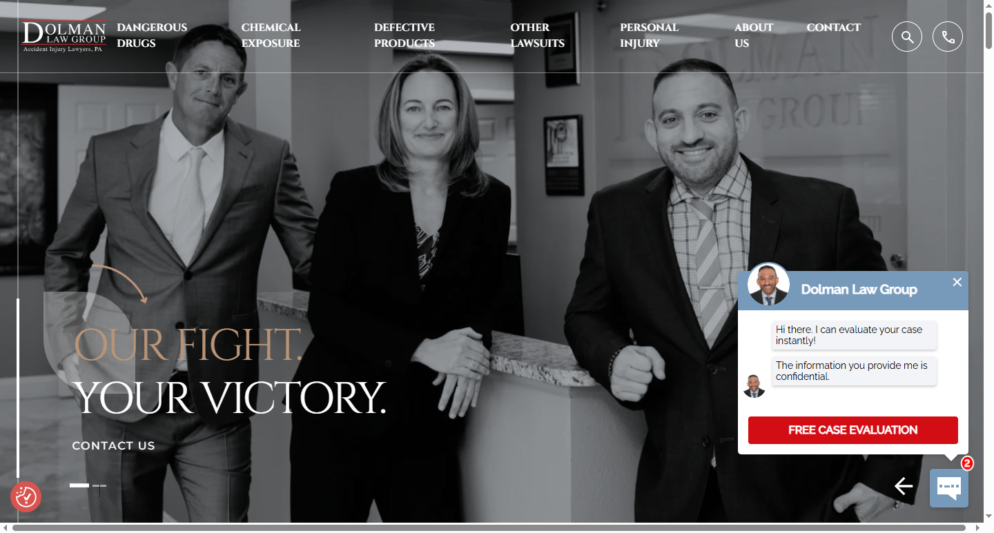
The Dolman Law Group website was designed to project strength, trust, and professionalism while embodying the firm’s identity as an award-winning Florida personal injury and mass tort law firm. The design combines visual sophistication with strategic functionality, ensuring that users immediately recognize the firm’s authority and commitment to client advocacy. Every page reinforces Dolman’s core message — “Our Fight. Your Victory.” — through confident design, bold typography, and purposeful hierarchy.
The layout was built with a conversion-focused framework to guide visitors seamlessly from information to engagement. From powerful hero imagery featuring the firm’s attorneys to interactive chat and case evaluation prompts, the site ensures a clear path to client contact without overwhelming the user experience. Optimized for SEO and speed, the site supports a vast content structure covering mass torts, defective products, chemical exposure, and personal injury cases across Florida and the U.S.
Design System & Visual Identity
The site’s visual tone captures authority and empathy through a refined, high-contrast palette and editorial-style typography.
- Primary Colors – Deep Navy (#152534) and Rich Burgundy (#7D1B1B): These hues convey trust, heritage, and strength, framing Dolman Law Group as both compassionate and formidable.
- Accent Colors – Warm Copper (#C9A47A) and Soft Ivory (#F7F4EE): Used in headings, call-to-actions, and overlays to create warmth and sophistication amid the bold contrast.
- Typography: The combination of elegant serif fonts for headlines and clean sans-serif text for body content establishes credibility while maintaining readability.
Photography is purposefully monochromatic or muted in tone, focusing attention on real attorneys and human emotion rather than stock imagery. The design’s symmetry and generous spacing create an editorial rhythm that mirrors the professionalism of high-end legal publications.
User Experience & Functional Highlights
The website’s navigation prioritizes clarity and accessibility, helping visitors quickly locate information on legal practice areas and case types.
- Prominent mega-navigation bar organizes high-volume practice areas like “Dangerous Drugs” and “Defective Products” with logical categorization.
- Persistent contact and free consultation buttons ensure immediate access to legal help.
- Integrated live chat and evaluation forms enhance user engagement and lead capture.
- Responsive design ensures the same premium experience across desktop, tablet, and mobile.
Accessibility and compliance were built into the UX design, providing smooth readability and WCAG-friendly color contrast ratios.
Outcome
The final website delivers a refined, client-centered digital experience that strengthens Dolman Law Group’s online authority and improves conversion flow. Its color palette, typography, and layout choices evoke confidence, compassion, and precision—qualities essential for a law firm that leads with results and reputation.