

Josh Brown
CEO & Founder, Josh Brown Consulting

Law firm logos are visual identifiers that represent a firm’s brand identity, professionalism, and values in the legal market. An effective logo for branding shows simplicity, memorability, and alignment with the firm’s positioning. Logos build trust by conveying credibility, stability, and authority, which strengthens reputation in a competitive environment.
A study by M. Molate, C. I. Ngwakwe, and K. N. Motubatse from the peer-reviewed repository International Review of Management and Marketing titled “Analysis of the Relationship between Corporate Branding and Sales Revenue during the COVID-19 Pandemic” in 2024 analyzed secondary financial statement data from exactly 74 global companies across multiple industries between 2019 and 2021 using multiple regression analysis to map how internal resources affect performance during a global economic shock.

Readability affects law firm logos because clear typography ensures accessibility across digital and print formats. Consistency in logo design reinforces recognition when applied across websites, business cards, signage, and social media. Design tips for clarity and impact include using professional fonts, balanced color palettes, and scalable vector formats that adapt to multiple platforms.
Lawyer logos, as a category of professional legal branding visuals, are customized for attorneys and law practices. The best law firm logos combine modern typography with symbolic imagery such as scales of justice or firm initials. Modern law firm logo examples favor minimalism, clean lines, and digital adaptability to achieve contemporary appeal. Consistency is key in law firm logo design, as uniform tone, color, and presentation sustain brand recognition and client trust.
Josh Brown helps law firms create logos through clear branding, readable design, and consistent visual identity. Contact Josh Brown for law firm logo design and brand development. Josh Brown connects typography, color, symbols, and brand standards with client recognition.
What are law firm logos?
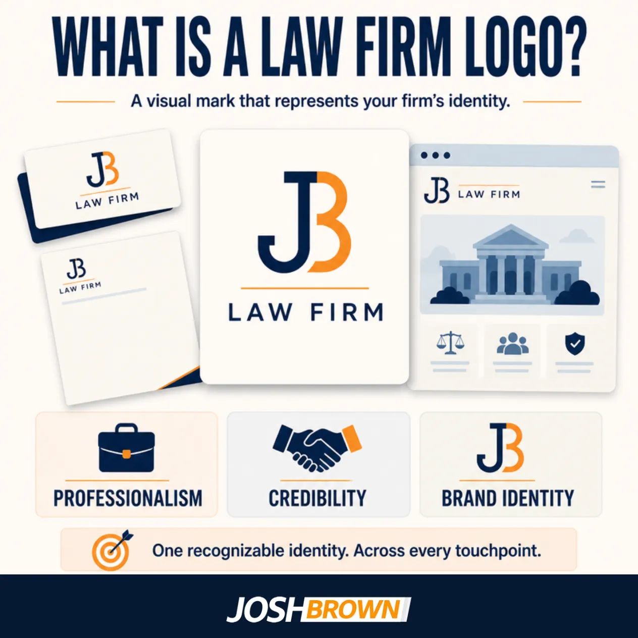
A law firm logo is a visual identity mark that represents a firm’s professionalism, credibility, and branding. Law firm logos function as recognizable symbols that distinguish practices, build trust, and reinforce client recognition across competitive markets. A clear and consistent logo strengthens brand visibility and communicates stability to prospective clients.
What makes a law firm logo effective for branding?
A law firm logo is effective for branding when it combines simplicity, memorability, and alignment with the firm’s values. Strong visual identity and branding through logo design depend on distinctiveness supported by typography and color psychology. Clean fonts communicate professionalism, while carefully chosen colors evoke trust, stability, or authority. An effective law firm logo strengthens recognition and reinforces brand identity across all client touchpoints.
How can logos build trust in a law firm’s brand?
Logos build trust in a law firm’s brand by conveying professionalism, stability, and authority through design elements. Clear typography signals reliability, balanced colors project confidence, and consistent design reinforces credibility in client perception. A well-structured logo communicates that the firm is established and trustworthy, which strengthens client confidence in its services.
How does readability affect a law firm’s logos?
Readability affects a law firm logo by ensuring typography remains clear and accessible across digital platforms and print materials. Font choice influences how easily clients recognize the firm’s name, while scaling determines clarity in both small formats like business cards and large formats like signage. High readability strengthens brand consistency and prevents misinterpretation of the firm’s identity.
Why is consistency important in law firm logo design?
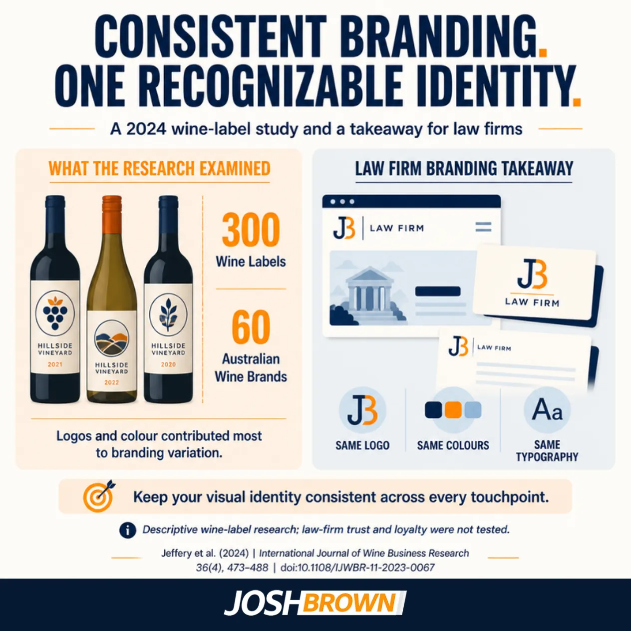
Consistency is important in law firm logo design because it reinforces brand recognition through uniform use of color, font, and proportions across platforms. A consistent logo creates familiarity on websites, business cards, signage, and social media, ensuring clients associate the same identity in every interaction.
A study by Jeffery et al. (2024) titled “Branding Consistency Across Product Portfolios in the Wine Industry” analyzed over 300 wine labels across 60 Australian wine brands. It found that consistency in visual branding elements like logos, colors, and typography contributed to consumer recognition and brand coherence. Consistent law firm logos strengthen recognition, credibility, and trust, which improves long-term client loyalty.
What design tips improve law firm logo clarity and impact?
Design tips that improve law firm logo clarity and impact include using simple typography, choosing professional colors, avoiding clutter, and ensuring scalability. Effective design principles that improve logo clarity ensure logos remain professional and recognizable across formats.
Listed below are the 5 Design tips that improve law firm logo clarity and impact.
- Use simple typography that is easy to read.
- Choose professional colors that convey trust and stability.
- Avoid clutter by limiting unnecessary details.
- Ensure scalability so the logo stays clear in small and large formats.
- State unique identity elements that differentiate the firm from competitors.
Can a logo strengthen a law firm’s brand?
Yes, a logo can strengthen a law firm’s brand by serving as a consistent visual marker of professionalism, recognition, and trust. A well-designed logo applied across websites, business cards, and social media builds credibility and reinforces client confidence. Consistent use of a logo creates familiarity that differentiates the firm from competitors and strengthens long-term branding impact.
Is consistency key in law firm logo design?
Yes, consistency is key in law firm logo design because cohesive branding across digital and physical assets reinforces recognition and trust. Uniform alignment of colors, fonts, and proportions ensures the logo projects the same identity on websites, business cards, signage, and social media. Consistency strengthens client confidence and sustains a professional image across every brand interaction.
What are lawyer logos?
Lawyer logos are professional branding visuals that represent individual attorneys or law practices through symbols of legal expertise and credibility. Solo practitioner logos emphasize personal identity and specialization, while firm-wide designs highlight collective brand identity and broader legal services. Lawyer logos strengthen branding by building recognition, projecting professionalism, and communicating trust to prospective clients.
What are the best law firm logos?
The best law firm logos are simple, readable, and timeless designs that balance colors and communicate professionalism in a competitive market. Logos with clean typography and uncluttered visuals remain distinctive across digital and print formats, ensuring long-term recognition.
A study by Hosseini et al. titled “Brand Visibility in Packaging” in 2024 used AI-based visual saliency mapping and found that logo placement and design influence brand visibility, supporting the idea that professionally designed, consistent logos enhance consumer attention and brand recognition. The best law firm logos maintain distinction while reinforcing trust and authority with clients.

What are the top law firm logos?
Top law firm logos are Skadden, Baker McKenzie, and Latham & Watkins.
Listed below are 5 Top law firm logos.
- Skadden
- Baker McKenzie
- Latham & Watkins
- Clifford Chance
- Dentons
What are examples of modern law firm logos?
Examples of modern law firm logos include minimalist typography logos, flat design styles.
Listed below are 4 Examples of modern law firm logos.
- Minimalist typography logos that prioritize clean text.
- Flat design logos that adapt well to digital platforms.
- Logos with abstract symbols that convey professionalism without clichés.
- Bold sans-serif font logos that project contemporary branding.